Todd Mitchell
GEOG-499c
|
Lab 8: Spatial Interpolation |
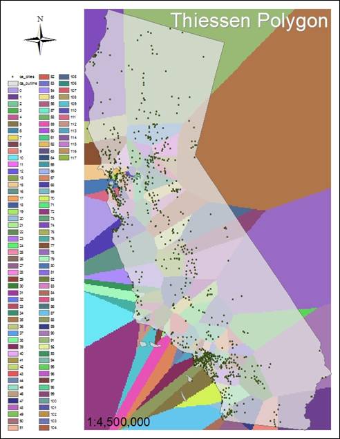
1. What is a Thiessen polygon?
Thiessen polygons are a kind of nearest neighbor
indicator. The points of each polygon
are defined by the perpendicular bisectors of the lines between all points.
2. What is the major difference between Hand-in 2 and Hand-in 3?
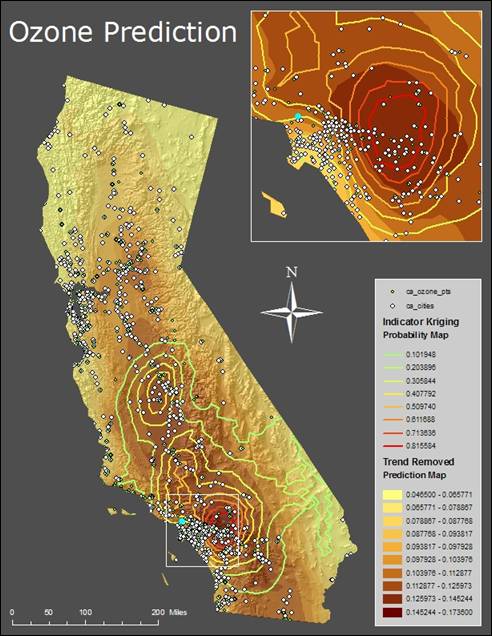
Why?
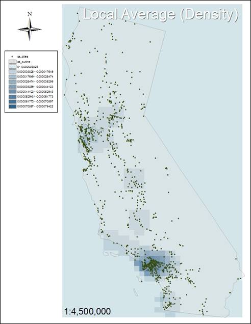
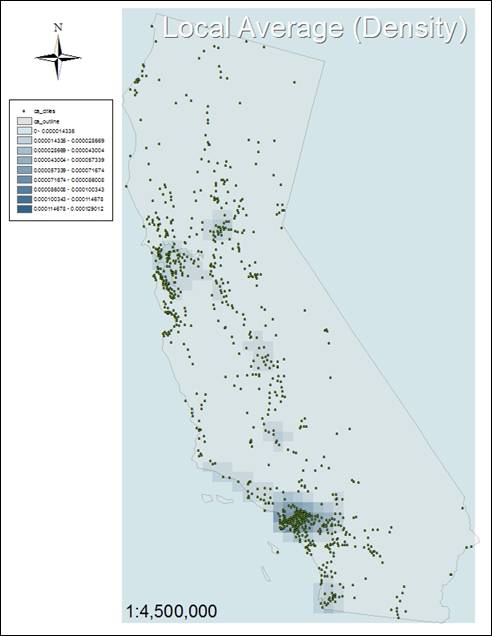
Simple
Density shows large areas, whereas Kernel Density shows smaller areas. Simple Density adds and divides cells to
calculate the emissions, and Kernel Density is a convolution from each emission
location to the search radius, resulting in a smaller area.
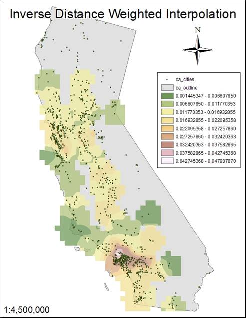
3. What is the major difference between Hand-in 4 and Hand-in 5?
Why?
Hand-In
5 shows a slightly finer division between classes than Hand-In 4. The exponential difference between ì2î and
ì3î is barely noticeable.
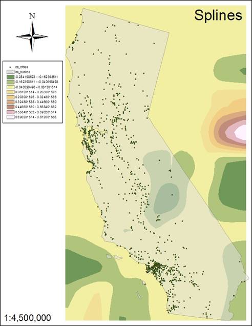
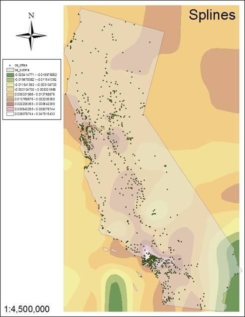
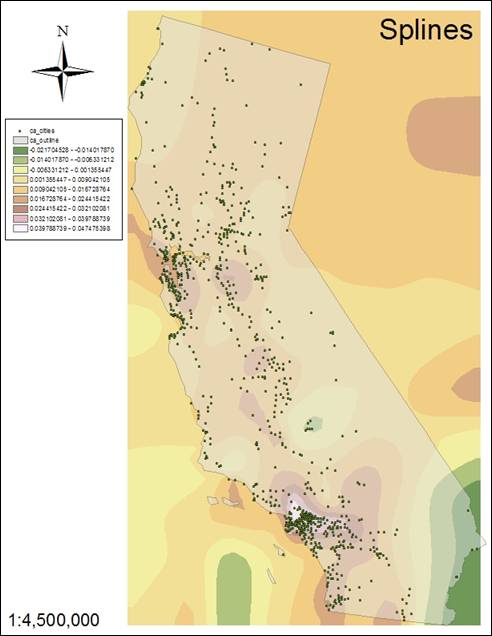
4. What is the major difference among Hand-ins 6-8? Why?
The
regularized spline (#6) is smoother in the area of
study versus the tension splines of #7 and #8. The regularized spline
creates smooth, gradual surfaces with values which may lie outside the data
range. A tension spline adjusts the surface based on trends in the data and has values
corresponding more closely to the data range.
5. What is histogram? What does the histogram on page 20 tell
you?
A
histogram is a graph of the distribution of data. Individual values are shown on the x-axis and
frequency (density) of those values is shown on the y-axis. The close approximation of a bell shape on
the page 20 histogram shows a normal distribution of data.
6. What is the QQplot?
This
compares the distribution of data to a standard normal distribution, allowing
an easy appraisal of the data.
7. Define the terms: Sill, Range, Nugget, and variogram. Estimate the value of sill range and nugget for
the variogram after step 10 on page 28.
Sill
ñ represents the value in a variogram when distances
are very large.
Range
ñ represents the lag distance in a variogram.
Nugget
ñ represents minute variations and measurement error in the variogram.
Variogram ñ a
graph showing the variance of the difference between two variables at two
locations.
The
estimated value of sill would be 29.28 x 10⁵ g, range would be 1.2 x
10-5 h, and nugget would be around 10 x 105 g.
8. What do the graphs tell you when you conduct cross-validation
analysis (page 35-36)?
This
shows me how closely the measured data matches the predicted values. The closer the model falls to the line, the
better the result.
9. Which is model is better after doing the comparison in
Exercise 4? Why?
The
Trend Removed model was the best because it had less microstructure error than
Indicator Kriging.
10. What does the map Indicator Kriging mean?
The
map shows values contained within a user defined threshold (0.12) as 1 and
values falling outside that threshold as 0. It is not representing the measured data as the Trend Removed model.
Maps:
Hand-In 1
|
Hand-In 2 (Simple Density) |
Hand-In 3
(Kernel Density) |
|
|
|
|
Hand-In
4 (Power 2) |
Hand-In
5 (Power 3) |
|
|
|
|
Hand-In
6 (Regularized) |
Hand-In
7 (Tension 0.1) |
|
|
|
Hand-In 8
(Tension 0.5)
Hand-In 9
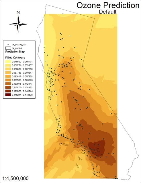
Hand-In 10
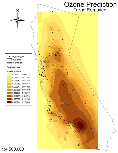
Hand-In 11
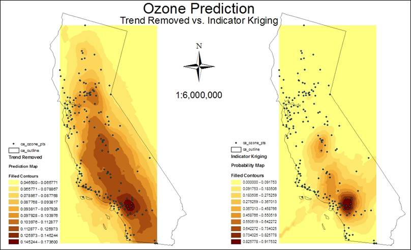
Hand-In 12
